What widget types are available for a customized dashboard?
Answer
Customized dashboards support progress gauges, status rings, bar charts, breakdowns, bubble charts, bullet charts, pie charts, graphs, highlights, maps, matrices, tables, and tables that display only the first few rows.
Overview
Customized dashboards can be created from components throughout the Siteimprove Information Platform (SIP). You can either add widgets from the library or export component to the dashboard from within SIP.
This functionality is available to all users with rights to create custom dashboards (by default this is set to Administrators and Account Owners).
Find out more in the article Siteimprove Dashboards and the interactive tutorial How to create your own dashboard.
When adding a widget from the library, you can filter the list by module and widget type.
The modules options include Quality Assurance, Accessibility, SEO, Policy, Analytics, Data Privacy, as well as widgets that are specific to DCI®.
The widgets types available are described in the following table:
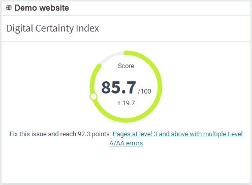
Progress gauge
DCI®, Accessibility, QA & SEO Score gauge.
Example
Status ring
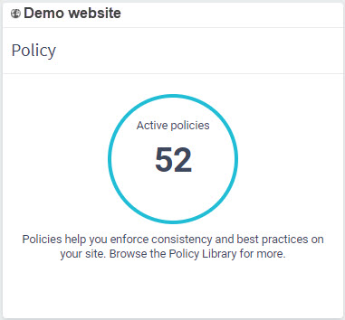
Ring displaying the status of a specific module.
Example
Bar Chart
Graph with rectangular bars.
Example 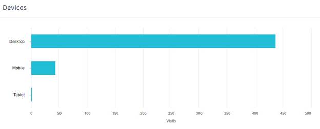
Breakdown
Breakdown of data into subcategories e.g. a breakdown of the DCI® score.
Example 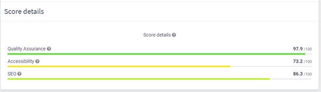
Bubble Chart
A scatterplot showing the relationship between two variables on the X- and Y-axes and differently-sized bubbles to represent a third dimension of data.
Example 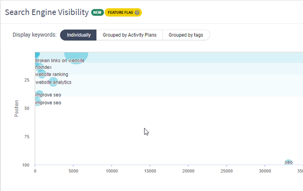
Bullet Chart
Variation of a bar graph; used to show how much progress has been made towards a particular goal, or how well something is performing against a benchmark.
Example 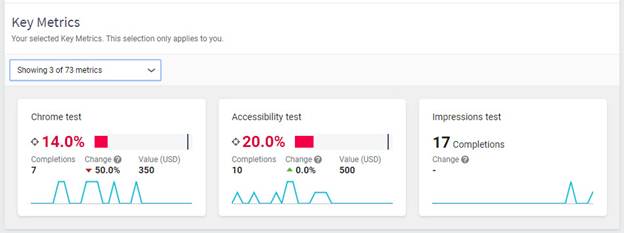
Pie chart
Circular pie chart or subdivided pie chart.
Example 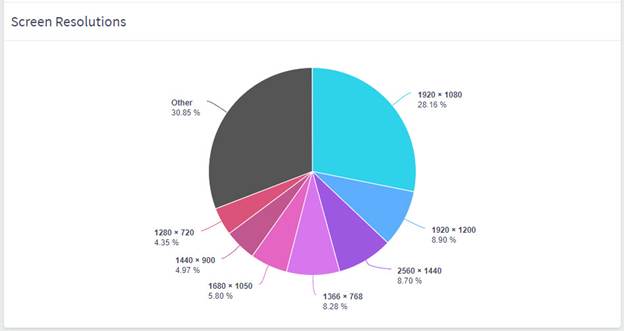
Graph
A diagram showing the relation between variables, e.g. events over time.
Example 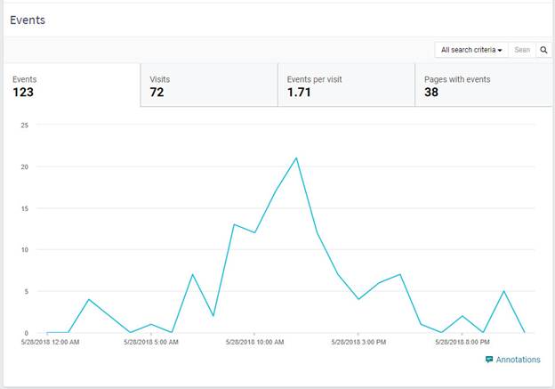
Highlights
Info bar with selected statistics.
Example 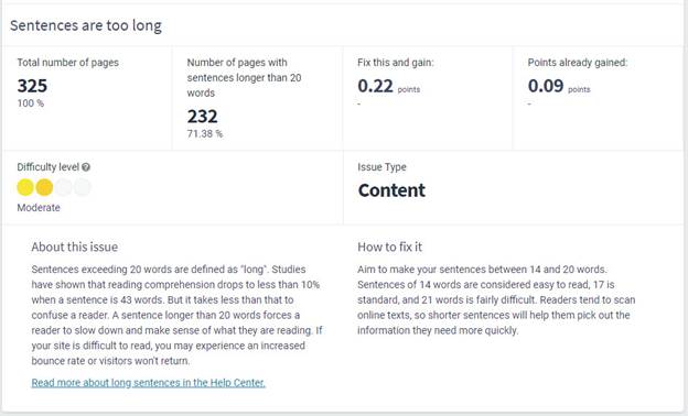
Map
Location map, e.g. showing the location of visitors.
Example 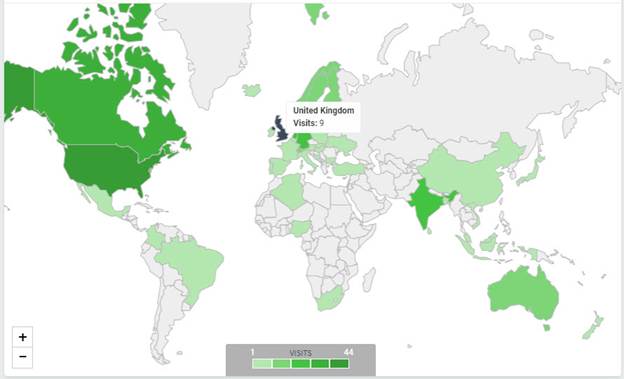
Matrix
Shows relationships between variables in a data set using a grid.
Example 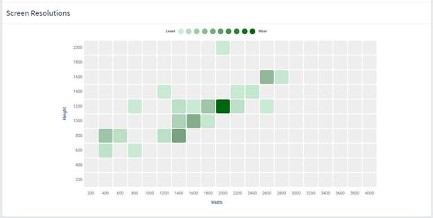
Table
Table of data in rows and columns.
Example 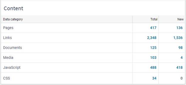
Table (First Rows)
Table displaying only the first few rows.
Example 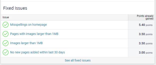
Did you find it helpful? Yes No
Send feedback